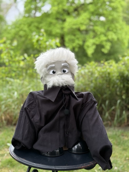
A — Photograph
The actual puppet from the Innovation Camp, cropped and framed. Most literally
this Albert. Visitor recognition is instant. Slight tension with the
otherwise-illustrated magazine aesthetic.
- Unambiguous identity — there is no other Albert
- Zero design effort, easy to swap if the puppet evolves
- A photograph in a typography-led site reads a bit "out of place"
- Tied to one specific puppet — harder for forkers to reuse
B — Editorial portrait
SVG illustration leaning into the historical Einstein silhouette: wide messy
hair extending past the head, heavy white mustache, suit + shirt + bow tie.
Warm-grey skin and cream hair pick up the design tokens, so it sits inside
the magazine aesthetic naturally.
- Distinctive — reads as this character, not generic illustration
- Integrates visually with the rest of the site
- Forkable — other regions can keep the silhouette, change the name
- More design surface to maintain / iterate on
C — Ink sketch
Single-weight ink lines, no fills except pupils and mustache. Reads like a
quick editorial sketch in a notebook. Plays well with the Fraunces serif
body — both feel like the same hand.
- Distinctive and "thinking-out-loud" tone — matches Albert's prototype spirit
- Lightest visual weight; doesn't compete with the form
- Smallest SVG; trivial to animate (hair tufts swaying, eyes blinking)
- Less immediately recognisable as a specific character
- Lives or dies on the quality of the line work; harder to perfect
D — Hand-drawn from the puppet
A traced illustration of the actual Wirkstatt puppet — big fluffy hair tuft,
the wide cartoon eyes with their sad-peaked eyebrows, the full white beard
covering the lower face, dark collared shirt. Foreground only; no garden
background. Hand-drawn line weight with a few pencil-shading wisps.
- Faithful to the actual character, not a generic Einstein
- Illustrated, so it sits inside the magazine aesthetic (unlike the photo)
- Forkable: silhouette stays, palette can be swapped per region
- More detail surface than C/E — more to maintain
E — Ink sketch, smiling
Same single-weight ink language as C, but Albert is glad to see you.
Eyebrows lift, the mustache curls upward at the corners, a smile peeks
out underneath, and small crinkles appear at the outer eye corners.
- Warmer first impression — invites you to write
- Keeps everything that makes C work (lightness, animatability)
- Smiling-by-default may feel less appropriate when collecting challenges
- Risk of "mascot" feeling if not paired with restrained typography
Pick one (or pair them — e.g. photo on detail pages, illustration on intake forms) and I'll wire it into the live /albert route.